The Fashion Studio

Made in Britain.

Simone Rocha

Simone’s signature has always been ‘Modern and strong, yet romantic’ and this collection was all of that and more. (Cliché but true!) And by more, I mean it was inspired by her grandmothers! I’m just going to say that if my grandmothers dressed anything like this, I would be raiding their wardrobes constantly. In fact, I would just build a den in them and be surrounded by prettiness. But anyway, let’s move away from the vision of ‘crazy fashion lady’ that is sure to be my future and delve deeper into the background of this collection.

Image

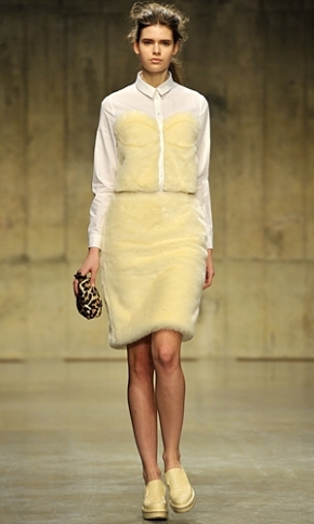
First and foremost, it is honouring both her Irish and Chinese heritage in a quirky, memorable manner. She used an admittedly odd, yet surprisingly coherent colour combination, including pastels, blacks, and browns; a merge of typical spring/summer colours AND autumn/winter colours. Her collection had a range of different fabrics that both contrasted and complimented each other; for instance this bodice, crafted in a pale yellow faux fur, contrasted against the classically cut vintage white shirt, which in turn contrasted against the animal print bag. She managed to merge the fabrics together without it looking tacky, and yet it was quirky enough to draw in attention.

Image

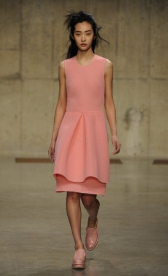
The cut of her clothes is pretty spectacular too because she used classic silhouettes with a twist. It’s important to remember that clothes need to flatter people as well as make fashion statements, and she does exactly that. Take this pastel pink dress for instance; peplums are on trend, right? So what does she do to make them hers? She drops the waist and bam! It’s transformed into a classy and quirky shape! Most people in their early twenties or late teens rarely find themselves in a situation that needs a classic peplum (it seems a little severe) but with this, I can envision it on a plethora of young adults worldwide! Dress it up with heels and a blazer, or even dress it down with a leather jacket and flats. If you can afford her Perspex brogues then that’s even better!

Image

If you’re looking for flattering shapes that have a touch of eccentricity, then this is definitely the collection for you!

Sophie Lau xoxo

http://sophieyanyeelau.wordpress.com/

Pictures from:

http://www.londonfashionweek.co.uk/designers_profile.aspx?DesignerID=1605
http://www.handbag.com/fashion/news/a459930/

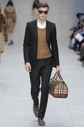
Burberry Prorsum

Burberry. What do you think of when you first hear it? Is it the trench? Is it a model? Is it the Burberry tartan? Well, I wouldn’t be surprised if you said yes to all three of them. But how many of you have actually been keeping up to date with Burberry’s latest fashion endeavours? Truth be told, I had resigned myself to the section of the population that will never wear Burberry, (partly because I can’t afford it), but since seeing its new designs, I’ve discovered a newfound love for it.

Image

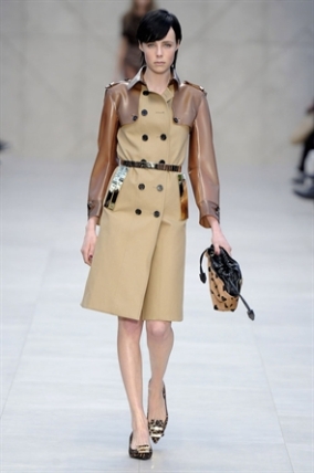
I mean, let’s have a look at this reinvention of their classic trench. Firstly, the shape is flattering since cinching does wonders for almost everyone. In my eyes, this is automatically a moment of ‘ohmygosh I really need to have one of these!’, but then it gets even better! There’s a translucent, almost rubberlike panelling that’s used for the sleeves and collar, making the trench look more fresh and appealing. The distinct lines of hard and soft between this fabric and the main body of the coat give it an updated military-esque look, allowing Burberry to shift its demographic to include younger people. (The perfect demographic for me! Here’s hoping! ^_^)

Image

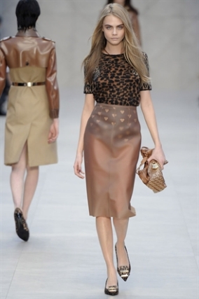
So, what else is new with Burberry? Where did Burberry take us in this collection? Well, the Serengeti was a pretty popular destination. Animal print seemed to be a staple ingredient for this collection, ranging from classic cheetah to slightly-less-often used giraffe; and yet the brilliantly executed tailoring stuck firm, thereby not turning the collection into ‘resort wear’. They even used a chic, black and tan heart print that was young and flirty without losing the classic Burberry elegance. They also included zebra stripes, which then morphed into thick bands of horizontal stripes in some statement shirts and trousers! Red and purple were also featured in this collection, welcome splashes of colour which lend themselves to luxury; and yet through simple colour-blocking simplicity was also achieved.  And of course, the collection was styled with simple statement bags and shoes. Oh, and the occasional pair of sunglasses.

Image

If I was to sum up this collection in one word, it would simply be ‘yes’. Just yes. It was a cohesive collection with a variety of different styles that catered to the needs of everybody, from more experimental fashionistas to lovers of the classic Burberry. I’m definitely looking forward to the next collection. What about you?

See ya next time!

Sophie Lau xoxo

http://sophieyanyeelau.wordpress.com/

Photos from:

http://www.londonfashionweek.co.uk/designers_profile.aspx?DesignerID=1245

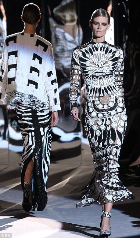
Tom Ford at London Fashion Week

Tom Ford’s debut collection at London Fashion Week has recently been a major talking point. In fact, it was one of the most highly anticipated shows. For who could resist the allure of the elusive Tom Ford, who was so openly insistent on avoiding showing here in past years?

Image

The collection itself is really just a combination of vivacity and old-school glamour. So where do we even begin? Well, the collection is ‘Cross Cultural Multi Ethnic’, which basically sums up the inspiration. The fabrics used were lavish and intricate and the clashing prints were unique and chic. In my humble opinion, this collection is simply fabulous.

Image

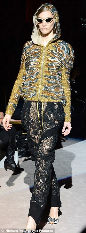
Take this hoodie and trouser combination, for example. Well, without seeing a picture, that seems slightly menial for a fashion week, doesn’t it? But in reality, Tom Ford has taken this in a completely different direction. The trousers are crafted from a delicate lace; they fall in a fashion which is light and airy, and although there are glimpses of skin, they speak of sophistication rather than vulgarity. The hoodie’s base colour is a bedazzled ochre, and the complimentary blues, bronzes and ivories appear to contour the shoulders and sculpt the torso. In fact, by applying such luxurious fabrics to such a widely-used silhouette, this outfit automatically becomes both current and coveted.

Image

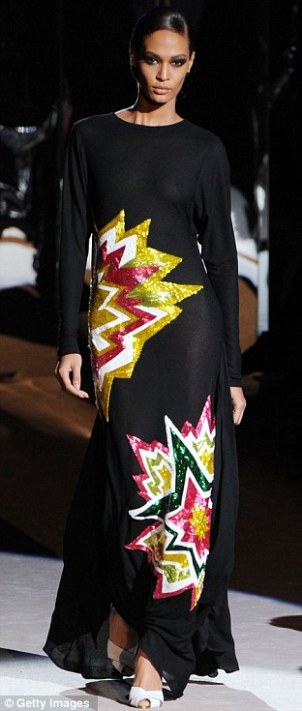
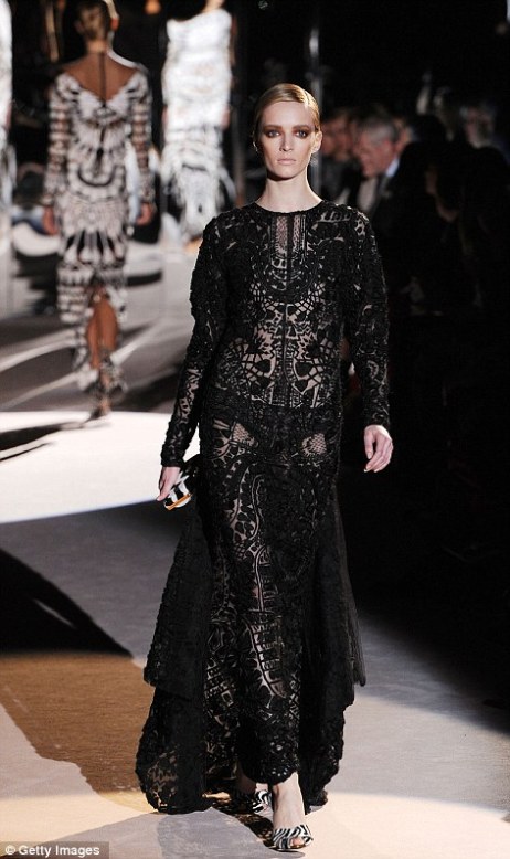
Tom Ford seemed to be fond of embellishments too this season. They were comic book-esque explosions, you know the ones with the onomatopoeias in the middle? Yeah, those, they made a pretty spectacular appearance on the runway, most notably on this draped black dress; they provided an almost ‘geek-chic’ look without being stereotypically so. Moreover, the bright colours contrasted against the darkness of the dress; and the understated elegance, conveyed through the high neckline and long sleeves, contrasted against the jagged edges and youthful tone of the embellishments.

Finally, this gown.

Image

I don’t think my words can do this any justice. My thoughts?

Wowser. 

Sophie Lau xoxo

(If you want to find out more about me, click the link below!)

http://sophieyanyeelau.wordpress.com/

Pictures from www.dailymail.co.uk/femail/article-2280787/

Kelly Shaw.

Kelly Shaw’s clothing tells an important story as well as being simply fashionable. Now, I know most designers say that, but let’s be frank here; they’re usually personal stories of triumphs and tribulations. Now I’m not saying that they aren’t important, because they are, just that they don’t necessarily correlate to the struggles faced by the general population. She, just like Banksy, takes a satirical look at the whole of society through art.

Image

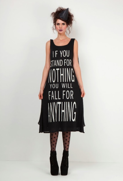
You might think this dress is like other sloganned clothing, just decorated with mindless words. But ask yourself this; is it really the same as wandering around with ‘GEEK’ emblazoned across your chest? ‘If you stand for nothing, you will fall for anything’ is a famous quote uttered by many, possibly most noticeably by Malcolm X, and it is something people should be proud to wear. It speaks of the struggles of society; of the people who believe in something; of the people trying to change the world in any way possible. Kelly Shaw is trying to change the world; she’s passionate enough about clothing to understand the influence it has on everyday life.

The monochromatic colouring of this dress conveys its message beautifully; the white of the writing represents the shining hope that breaks through the darkness and dreariness of society, which is represented by the black fabric.

Image

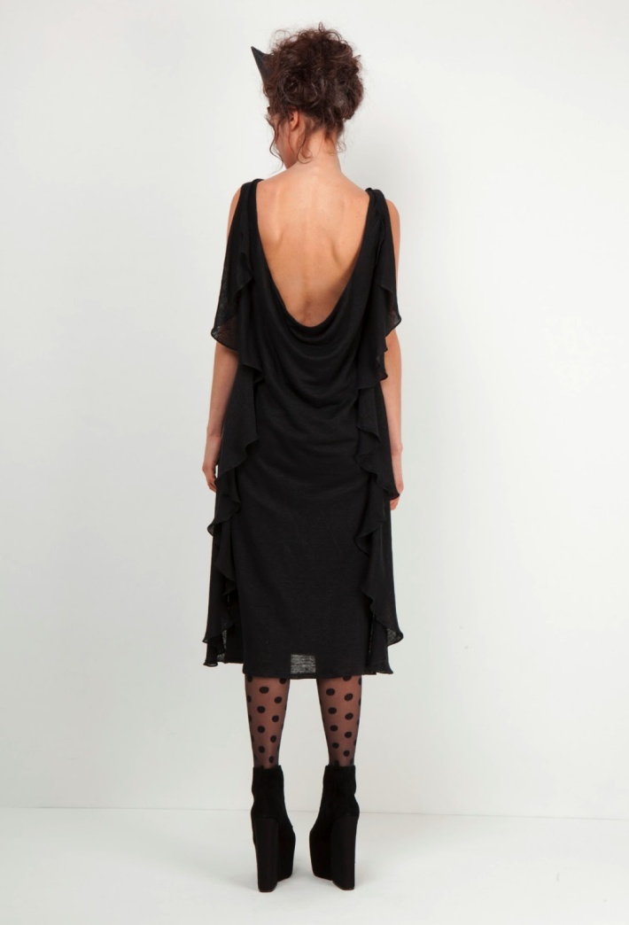
When the back of the dress is shown, it’s impossible to doubt that this is a piece of art. The material will cascade beautifully down anyone’s back, and it’s the perfect representation of the sometimes tumultuous world that humans leave behind unintentionally.  The world right now is full of beautiful things, and yet it is so often marred by chaos. As a collective unit, we need to discover the things that are actually important, and Kelly Shaw’s collection is definitely provocative enough to help us do so.

Image

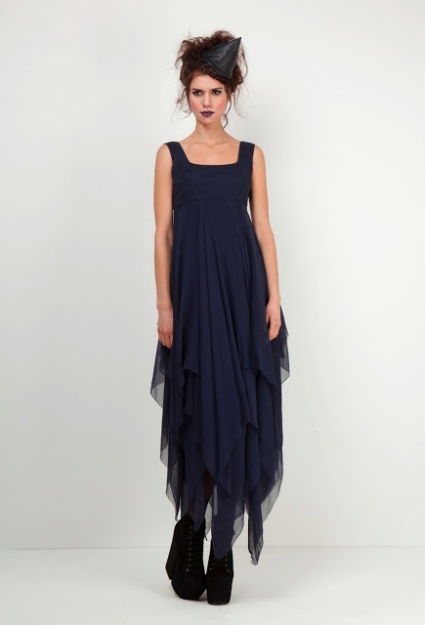
On a lighter note, we mustn’t forget the wide appeal her clothing has. Black is a colour universally acknowledged to flatter everyone and her designs enhance the beauty of the colour. However, she also carefully injects navy blue into her collection and these dresses are beautiful. For example, the one above is floaty and ethereal. It’s whimsical without being wacky and delicate without being weak. The neckline is simple, exposing the collarbone, and draws attention to the lower half of the dress which will elongate the appearance of a woman’s legs.

Also, her styling is, well, stylish. The angled witch’s hat, along with the slightly ruffled hair, gives a playful twist to her clothing, and the makeup is minimal, with a splash of purple lipstick that compliments the outfits.

 All in all, it’s a pretty remarkable collection!

 Be sure to check out her blog and website because she’s a pretty inspirational person! ^_^ (It doesn’t hurt that her clothes are beautiful too!)

 http://kellyshawlondon.blogspot.co.uk/

http://kellyshaw.co.uk/

Sophie Lau xoxo

http://sophieyanyeelau.wordpress.com/

Topshop LA opening.

A little bit of Made in Britain across the water.

The LA opening of Topshop’s new flagship store brought with it two dresses made here in East London.

The kelidoscope prints matched  up to the mm in this patchwork design.

These dresses were restricted to just 100 of each style in the exclusives range at Topshop. Launched just before Christmas these styles had a huge amount of work that went into them.

As you can see for yourself they are beautiful and as much as they have hanger appeal these dresses definitely wear the person and are not just being worn.

                                                                                                                                                                  3  katherine_jenkins     Kate-Bosworth-Topshop-Los-Angeles-Opening-Chic-01

Beautiful don’t you think.

x

BRIT awards 2013 Best and Worst Dressed! (kind of)

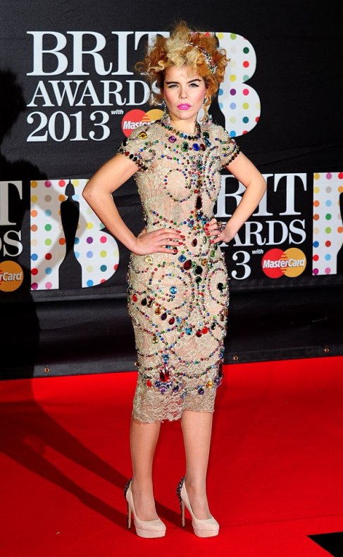
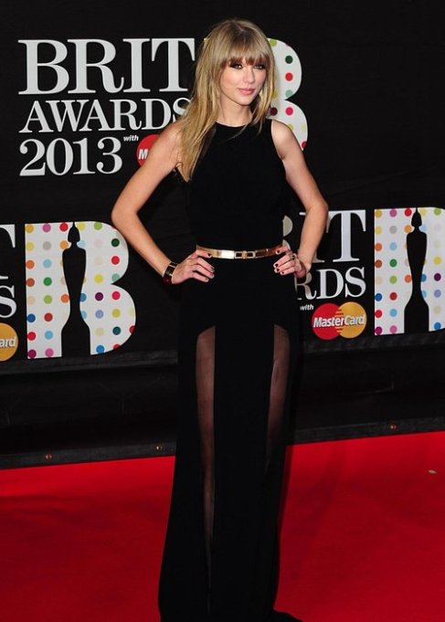
I’m sure by now, (2 days after the BRITs), you would have read up on all the major style mishaps, but if you haven’t, I’ll be discussing the pros and cons of each of the ‘worst dressed’ people’s outfits. (As for the best dressed, I think Paloma Faith and Taylor Swift looked fabulous!)

Image

Image

Yes, I know the title of the piece is ‘best and worst dressed’, but who am I to say? Isn’t beauty in the eye of the beholder? Everyone has a different style, and most people have different notions on what looks ‘fashionable’; personally I feel that if they felt comfortable on the red carpet, then nothing else ought to matter. On the other hand, if they didn’t, then maybe they should employ a different stylist…

Let’s get started!

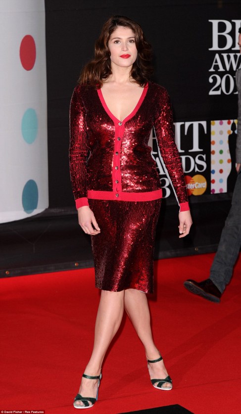
Gemma Arterton has pretty much been hailed by the general public, and most articles, as the worst dressed, but why?

Image

Well, first of all, it was a bright red garment. Red fabric usually doesn’t translate well on the red carpet for obvious reasons (we’ll exclude Rihanna’s Grammys dress because that was just spectacular). Moreover, the whole outfit looked slightly out of place at the BRITs; the hemline fell far too short to be an elegant gown, and yet slightly too long to be an edgy dress. Furthermore, the cardigan seemed to end on her hips, causing her enviable hourglass figure to get lost in translation. However, we mustn’t forget that it is very much a dress for this season, designed by Jonathan Saunders, and it was merely that the outfit didn’t work on her figure, and not that the outfit in itself was terrible.

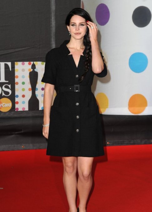
Lana Del Rey’s outfit was at the other end of the spectrum and was void of any glitz at all.

Image

It seemed slightly underwhelming for an event such as this; although the silhouette was flattering on her, it seemed slightly too casual. It either needed to be brightened up by a few bright colour accents, (maybe on the belt or shoes?); or it needed to be more of her quirky 50s/60s ‘Vintage Americana’ style. Don’t forget that this was a Chanel dress though! It was designed to be classy and sophisticated, although perhaps it’s tailored more to a garden party than the red carpet?

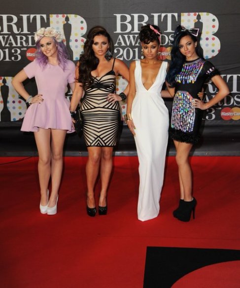
Finally, we have Little Mix. Frankly, I don’t think they looked like part of the same girl-group anymore, however we should applaud them for each embracing their individuality.

Image

We’ll start with Perrie’s  Natalia Kaut dress. I feel that the lilac was the perfect choice against her skin tone and hair, and her shoes were teemed brilliantly with the ensemble. However, I feel that the hem was a few inches too short, and the roses on her hairband were too big.

Jesy’s Celeb Boutique dress was the perfect silhouette to showcase her amazing figure; however, I feel the geometrical print was far too busy and drew the eye to too many places at once. Perhaps it would have been better if the print was only on the bodice?

Leigh-Anne’s Aqua dress was classy and elegant, and the white looked amazing against her skin; however, the accessories weren’t reflecting the glamour of the dress. The matching pink bow and pink shoes were detracting from the elegance, making the look a weird amalgamation between casual and elegant. In my opinion, I think the gold hoops were also slightly too chunky.

Jade’s Mary Benson dress was quirky and interesting, and her legs looked amazing in her heels; however, the choice of trimming on the sleeves and hem was slightly confusing, and the bow in her hair would have been better if it was smaller.

So that’s all folks! I hope this has given a more objective view on the ‘worst dressed’ at the BRITs!

Sophie Lau xoxo

http://sophieyanyeelau.wordpress.com/

Pictures from:

http://www.capitalfm.com

http://www.dailymail.co.uk

http://www.mamamia.com.au/

House of Hackney.

The House of Hackney is, for want of a better word, amazing. As you first look at one of their garments in person, it might be the soft, luxurious feeling of the silk that draws you in, or it might even be the hanger/manikin appeal it has. On the website, it may simply be the colours, or even the words used to describe it. I mean seriously, owning a ‘silk smock dress’ would be a dream come true for most fashionistas, but each item is so much more than it first appears to be.

Image

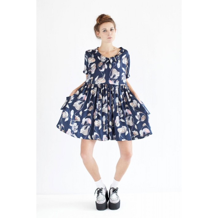
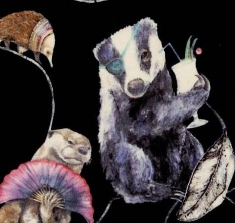
Let’s take the Hackney Empire Silk Smock Dress for example. How many of us will actually read the description and see the words ‘carnival of animals’? At first glance, it seems to be a pretty, floral printed dress, but each ‘flower’ and ‘leaf’ that we see is actually an animal! I’ll be honest here and say that if I didn’t have this article to write, I would sit and play ‘let’s spot the next hilarious animal combination and make up a story that revolves around it!’ But I do, so here I am. You might very well be judging me, so here’s a picture of an otter holding a fan; whispering a secret to a badger pirate who’s sipping a cocktail; whilst a spy hedgehog wearing a brightly coloured fashion-forward necklace is covertly listening to their conversation.

Image

I could explain all the stories to you, but where would the fun in that be? You ought to go on their website and spend hours doing it yourself! In fact, if I had enough money I would completely decorate my room in their wallpaper, but I don’t, so I’m going to need to live vicariously through anyone that does. So, if any of you are lucky enough to even have a smidgen of their wallpaper, why don’t you drop a comment? That way we can all rejoice over your spectacular taste! ^_^

Okay, so rant over; let’s move on to the garments themselves and away from the adorably cute and innovative print. The garments look both youthful and sophisticated, which to be honest is quite a hard combination to come by nowadays. The Dalston Rose Smock Dress is a prime example of this.

Image

Image

It has a navy print which fades out beautifully as the navy dip dye fades in. The cream and navy offset each other nicely without it being overtly ‘in your face’, and yet it’s inspired enough to look fresh and edgy. The peter pan collar cleverly acknowledges the fashion trend, as by making it in the same fabric as the rest of the dress, it’s there as a subtle feature as opposed to an add on. And finally, the pockets are genius. Simply genius. They’re so cute and give the dress a classic silhouette with a twist. If you own one of these, consider yourself extremely lucky.

Of course, the styling is extremely important. The House of Hackney styles their photos simply, but artistically, and therefore the beauty of the garment isn’t lost. Of course, we don’t expect you to walk around carrying one of their lampshades (unless you want to, then kudos to you), but doesn’t the corresponding ombre of the lampshade make the dress look even prettier? The lack of ostentatious accessories and make up also enables you to have your own ideas on how to style it, and obviously we’re all for making each piece your own. Currently we’re making more of their garments in different prints so be sure to keep an eye on their website!

http://www.houseofhackney.com/index.php/

(Maybe keep an eye on us too?)

Sophie Lau xoxo

http://sophieyanyeelau.wordpress.com/

Terence Donovan


Terence Donovan

Terence Donovan Fashion is the latest photographic related fashion book, with images chronologically organised in the journey of his life and how the fashion industry had changed from the 1960’s to 1990’s. Donovan was amongst one of the greatest fashion photographers of his time. With his working class background and outlook on photography he was able to make a major name for himself in London’s Swinging 60’s.

16 years on from his death, widowed wife Diane Donovan and former art director David Hillman published a book dedicated to his images. Two people who worked closely to Donovan, chose images which represented his life.

The book is made up of 176 images all in chronological order. Being the first time his photography has been put together via publication. Starting from the monochrome work produced in the 1960’s and 70’s, all the way to more colourful illustrations in 1980 and 90.

Its a great influence for many generations and no doubt it will be a good seller and a great read, with added text from historian Robin Muir and Vogue creative director Grace Coddington.

Terence Donovan Fashion, edited by Diana Donovan and David Hillman with a text by Robin Muir and foreword by Grace Coddington, is published by Art /Books , £60.00 hardback. www.artbookspublishing.co.uk

All photographs Terence Donovan copyright © 2012 Terence Donovan Archive.

The New Year.

The New Year for Fashion Enter.

We have some wonderful and exciting things happening as a company in 2013.

Our Factory based in North London is moving house. Leaving it’s home in the Forentia Clothing village to a much bigger premises.

The Studio is remaining in East London, and our production space is getting ever more busy.

Having being close from the 21st December, we have opened back up for business well rested today.

Christmas.

As this is the last week before Christmas our machinists and pattern cutters are busy busy getting everything ready before we close for the break.

We are so busy at the moment, having just finished a huge order from House of  Hackney we have now gone straight into some lovely Uniform dresses for Michael Azu.

I would recommend having a nosey at House of Hackney’s website over the next coming months to see what they have to offer.

Their prints and fabrics are beautiful, if only we could decorate the studio in their wall paper!!

http://www.houseofhackney.com